Moisture Variations in Dye Painting
Chapter 4 of Ann Johnston’s Color by Design is my favorite so far in our Dyeing Support Group. My favorite is the organic quality you get from painting on soda-soaked wet fabric and applying pressure to plastic over the top.
Thin Paste on Wet Fabric with Primary Colors - I like that you get secondary colors as the dyes bleed into each other; especially after pressing the plastic on top.
2nd sample of Thin on Wet Primary Colors
My Favorite - I love the surprise organic lines and shapes of the thin paste on wet soda-soaked fabric
Thin on Wet Secondary Colors and neutral created by adding the secondary colors together.
2nd Sample of Thin on Wet Secondary Colors
Textured Objects placed underneath wet soda-soaked fabric and thin dye painted with brush - I enjoyed this technique
Thin Paste on Dry Fabric is my least favorite. I can see circumstances where you would want less bleeding until the edges to keep some white or light areas. Maybe I would prefer it if I tried different shapes and colors.
Thick Dye painted on wet soda-soaked fabric
Thick Dye on Dry Fabric
Print Paste painted on fabric before adding medium thickness dye painted on with sponge brushes. This was nice and evenly blended and then I decided to add additional colors with a dryer sponge brush. I don’t really like sponge brushes but they have their purpose. I much prefer using paintbrushes.
Combination of thick and thin colors painted on dry fabric
I was surprised how much more I enjoyed the exercises on wet soda-soaked fabric over the dry fabric. The fluid organic lines and intermixing of colors had interesting results. I will definitely spend more time with the same techniques and additional colors with varying thicknesses of print paste.
Chapter 3 Exercises
I am behind on posting images for the Dye Support Group. Life seems too busy some days to take the time to blog about my life. Rewind a couple of weeks to my first attempts at exercises from Chapter Three of Ann Johnston’s Color By Design. I learned a lot from each exercise and need to revisit several at a later date to get accurate results. I enjoyed working for my sketchbook only and had some happy accidents along the way even when I missed the mark.
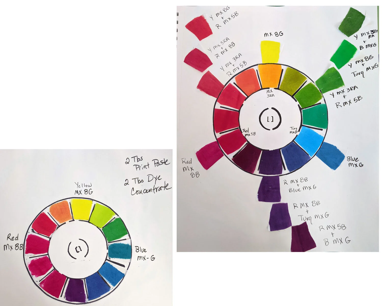
Paint a Color Wheel - My first and second attempts. I need to go back and try a third time especially in the red variations.


For green, I started with an equal amount of yellow and blue and then added yellow incrementally. I approached the exercise mathematically. I thought if I started with equal amounts, I would get a base color to work from. In the future, I think I should start with yellow and add blue in small increments. The blue was dominant and it required much more yellow than I anticipated.

Lessons learned - pay better attention to painting straight so as not to overlap lines next time. I added blue to yellow this time but only in 1/4 tsp increments. I need to start on a larger piece of fabric or adjust my increments so I can get from yellow to blue.


I need better lighting in my laundry room. When wet, it appeared I was achieving black. Once dry and in better lighting, it was obvious that I need to try again. Or, stick with using the premixed black dye powders I generally use until I can try this exercise again. I really like a lot of the colors though so am keeping these pages for future reference.

I really should have started over and done all of these another time. However, I’m impatient and wanted to get to the next Chapter. So, I am working out some of the issues I had here while working on future Chapters.