Thread Stash 101
Detail of Life in Abstraction ©Amanda Snavely
Hand-stitching through layers of fabric requires auditioning many different types of thread. I also paint many of my backgrounds with acrylic paint which requires me to pay close attention to the size of the hole my needle makes when stitching. My work is heavily hand-stitched so fibers that don’t fray, fuzz, or tangle are a must. I work across the surface of my work so I do not like using hoops that limit the stitching area to a small square or circle. Instead, I use felt as my inner layer to stabilize the fabric for hand-stitching without a hoop or frame. For extremely large pieces I do have a rug frame that allows me to scroll large sections for stitching at the time.
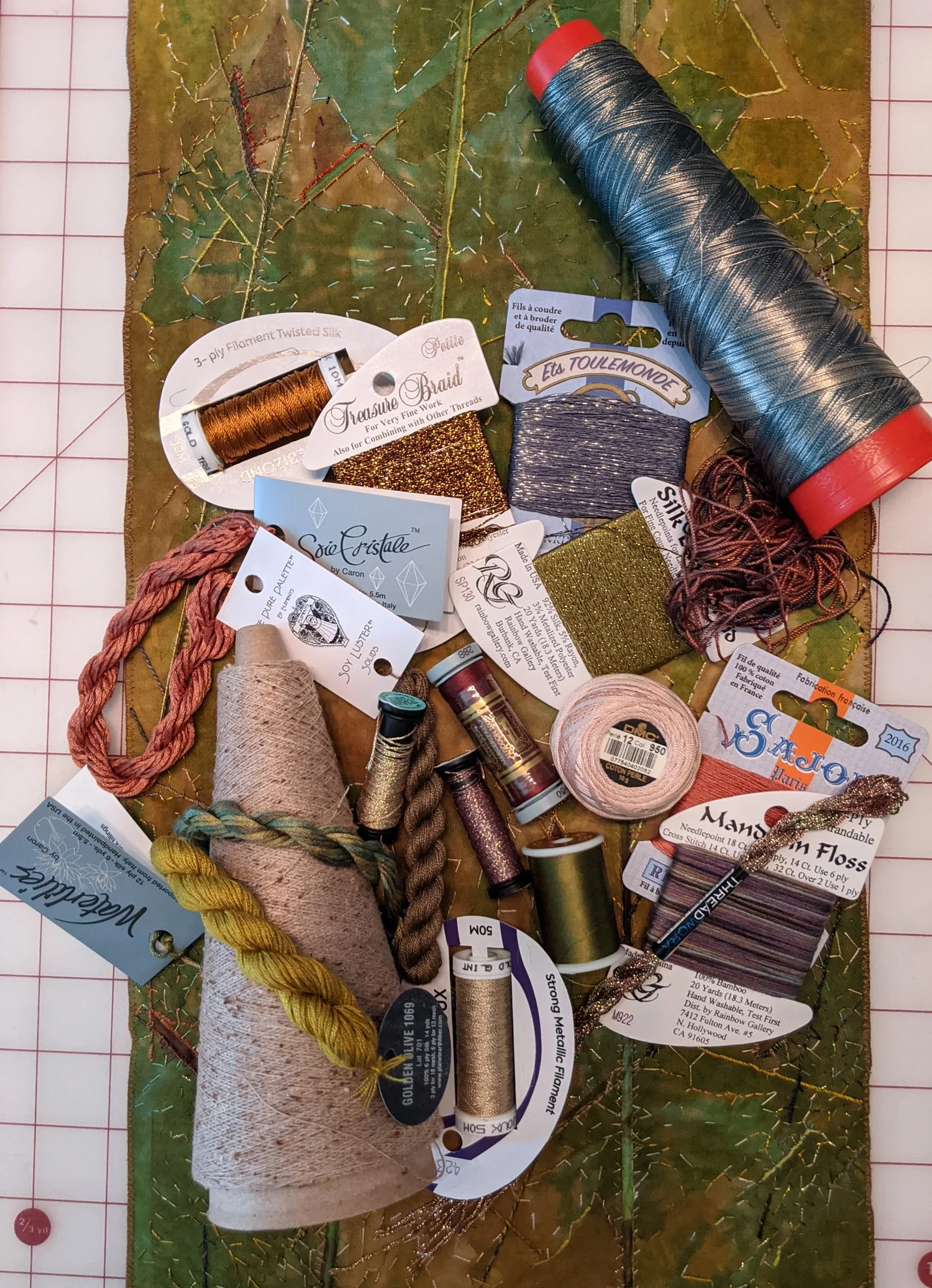
Picking threads prior to stitching
For variety, in material, finish, effect, and stitch size I use a large number of threads per piece. The above photo only includes some of the threads I selected for the background of this 6” x 8” piece I later stitched for the SAQA 2022 Spotlight Auction.
Detail after stitching
Photographing metallic threads can be a challenge but this photo gives you an idea of the range of threads combined in a piece of my work.
Welcome to my Thread Stash.
The most affordable option for some stitches is using traditional sewing threads such as Guttermann Viscose, Cotton, Polyester, or Silk thread. I use Guttermann, Sulky, Superior, and other brands for hand and machine stitching. I divide the threads by material in Ikea drawer organizers like the above one for Viscose.
Cheap embroidery threads like these from Simthread I get on Amazon to fill in random colors. These do unravel very easily off the top of the spool. I use Hugo’s Amazing Tape to keep these threads from turning into a bird’s nest.
Presencia’s cotton sewing thread’s color selection is one of my favorites for use with my hand-dyed fabric.
I especially like the look of small stitches in 100% silk. I use a variety of brands of silk thread similar to the Tire silk above.

For thicker threads, I use some DMC 8 or 12 cotton pearl. Presencia No 8 or 12 also works. Presencia No 16 is a little thicker than I generally prefer to hand-stitch with though I have a few still in my stash.
When I am hand-dyeing fabric with Procion Fiber Reactive Dyes I throw in the thread I have prewrapped on plastic thread organizers. I loosely wrap the thread. It does variegate depending on the resist of the layered wrapping on the dye accessing the fibers when bound. I like this variegation but if you do not, opt to loosely tie hanks of thread and dye flat in a pan instead of tossing in the bucket with fabric. I use cotton or silk thread in natural colors to add to my dye pot. I particularly like the silk thread from Aurora Silk in Oregon for dyeing.
A heavier weight fiber of 100% Tencel I like is dyed by Teresa Ruch. Her variegated skeins like the ones above offer an interesting range of color. I do need to try a better way of keeping these untangled once I begin using them though.
I prefer the 10/2 weight for hand-stitching. I love the look and feel of many yarns primarily used or knitting, weaving, or crochet but many do not work well for hand-stitching fabric. You can couch thicker yarns but I prefer to use the thinner yarns to stitch with instead of couch.
Habu Textiles offers fabulous different fibers for accents. They are more temperamental to work with though, so I only use them for small pops of color, texture, or interest.
I have a love/hate relationship with metallic threads. I have finally narrowed down my selection to metallics that do not make me scream in frustration. Giovanna Imperia Metal Gerbera or Verbenna were my favorite when they were still available online.
Kreinik Metallics are my favorite choice to find locally at needlepoint or embroidery stores. I prefer to see pick colors in person versus online whenever possible.
Kreinik Metallics are my primary metallics for hand-stitching. The metallic braids work for stitching my layers with very little fraying issues. I use #16 braid, Tapestry #12 braid, Fine #8 braid, and very fine #4 braid. #16 is a little thick for my preference so I only use it for added emphasis areas.
Soy Luster is a newer addition to my thread stash. I don’t like fuzzy threads but have found this Soy Luster appears fairly smooth when stitched through most of my layers.
Silken Pearl is one of the other miscellaneous brands I have tried and like though it is a bit more expensive so I only use their variegated options.
I sometimes try other new threads based on color. I generally only buy one or two colors before buying more. Treasure Braid metallics was my go-to until I switched to Kreinik Metallics. Sajou 100% cotton is a newer addition to my stash but I like it so far.
I often take a piece in progress with me to the store with a photo on my phone showing some of the threads I already plan to use. Otherwise, I find I often buy a lot of similar colors to ones I already have in my stash. This helps me expand my stash without too much overlap.
My final thought on thread for hand-stitching is that I am always looking at what brands are being used by artists I like. The lists of vendors, materials, tools, etc. in the back of books by author’s I like is always a great place to find more options. There are tons of different threads available but many are not meant for the friction of hand-stitching through fabric layers unfortunately.
Moisture Variations in Dye Painting
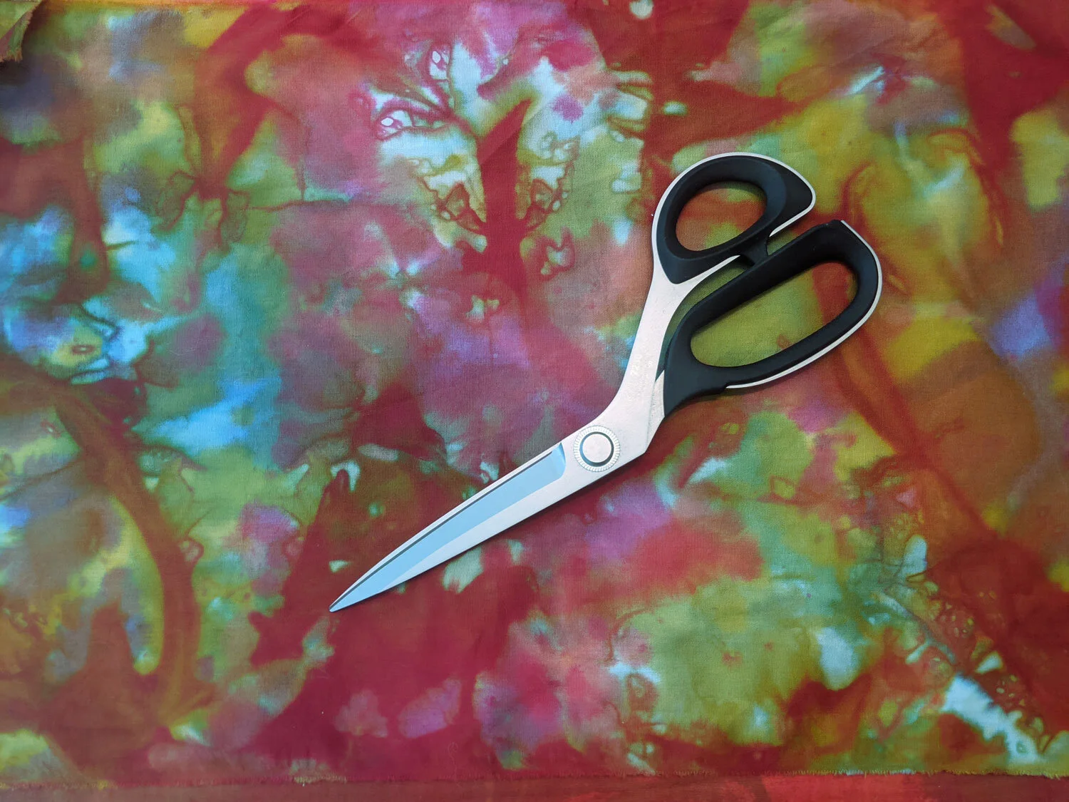
Chapter 4 of Ann Johnston’s Color by Design is my favorite so far in our Dyeing Support Group. My favorite is the organic quality you get from painting on soda-soaked wet fabric and applying pressure to plastic over the top.
Thin Paste on Wet Fabric with Primary Colors - I like that you get secondary colors as the dyes bleed into each other; especially after pressing the plastic on top.
2nd sample of Thin on Wet Primary Colors
My Favorite - I love the surprise organic lines and shapes of the thin paste on wet soda-soaked fabric
Thin on Wet Secondary Colors and neutral created by adding the secondary colors together.
2nd Sample of Thin on Wet Secondary Colors
Textured Objects placed underneath wet soda-soaked fabric and thin dye painted with brush - I enjoyed this technique
Thin Paste on Dry Fabric is my least favorite. I can see circumstances where you would want less bleeding until the edges to keep some white or light areas. Maybe I would prefer it if I tried different shapes and colors.
Thick Dye painted on wet soda-soaked fabric
Thick Dye on Dry Fabric
Print Paste painted on fabric before adding medium thickness dye painted on with sponge brushes. This was nice and evenly blended and then I decided to add additional colors with a dryer sponge brush. I don’t really like sponge brushes but they have their purpose. I much prefer using paintbrushes.
Combination of thick and thin colors painted on dry fabric
I was surprised how much more I enjoyed the exercises on wet soda-soaked fabric over the dry fabric. The fluid organic lines and intermixing of colors had interesting results. I will definitely spend more time with the same techniques and additional colors with varying thicknesses of print paste.
On My Bookshelf
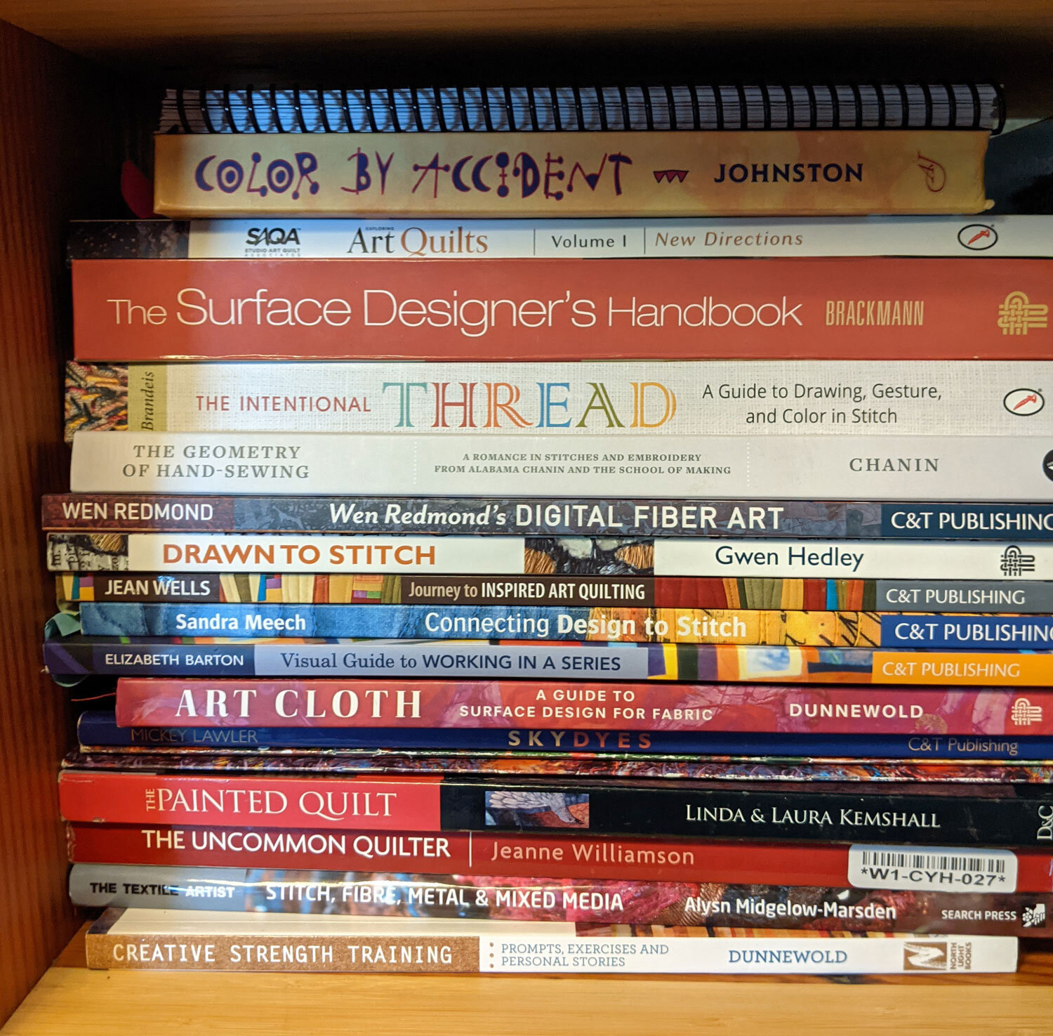
I am a Library Fanatic. I read extremely fast and often; multiple books a week. I love cozy mysteries, FBI/Forensics/Serial Killer Mysteries, Sherlock Holmes, Gardening, Cookbooks, and many of the books from High School or College Reading Lists. I have to read books of a series in order. So, I maintain a spreadsheet sorted by the author with the last book I have read in each series. Sadly, I have checked out and returned so many art books over the years that I have not kept track of which were good, bad, or just ok. I have found, however, that I am an art book snob. Most instructional art books you find in bookstores are written for the beginner in every form of art or are projects to complete. The library shelves are the best place to find Specialty Topics, Intermediate, and Advanced Level books. I detest dusting, so I only purchase a few books for my personal reference collection. Generally, I buy art books that I have already checked out multiple times from the library or ones that I can’t get from the library. Welcome to my bookshelf.
HIGHLIGHTS
Dyeing:
Color by Accident - Ann Johnston
Color By Design - Ann Johnston
Fabric Dyer’s Dictionary - Linda Johansen (I bought the e-book version. It is a pain to flip through to look for a specific color on my IPAD. I need to buy a used copy as it is out of print)
Surface Design:
Art Cloth - Jane Dunnewold
The Surface Designer’s Handbook - Holly Brackmann
Visual Texture on Fabric - Lisa Kerpoe (Resist Technique Options)
The Painted Quilt - Linda & Laura Kemshall (Short Overview of Techniques but visually appealing for an older book)
Digital Fiber Art - Wen Redmond
Quilt Related or 3D Fiber:
Disclaimer: I have never been a traditional quilter so have a few just to flip through or loan out
Journey to Inspired Art Quilting - Jean Wells
Visual Guide to Working in a Series - Elizabeth Barton
The Uncommon Quilter - Jeanne Williamson
Exploring Dimensional Quilt Art - C. June Barnes
Stitch, Fibre, Metal & Mixed Media - Alysn Midgelow-Marsden
Three - Dimensional Embroidery - Janey Edmonds
Stitching:
The Intentional Thread - Susan Brandeis (Written by my college professor so I may be biased, but I learn something every time I pick it back up)
Connecting Design to Stitch - Sandra Meech
Drawn to Stitch - Gwen Hedley
The Geometry of Hand-Sewing - Natalie Chanin (Variety of stitches shown; images are not annoyingly cutesy or crafty like most embroidery related books)
Poetic Cloth - Hannah Lamb (I’m not sure I learned anything new from this book, but I like flipping through it. It is visually soothing, like visiting the spa.)
Chapter 3 Exercises
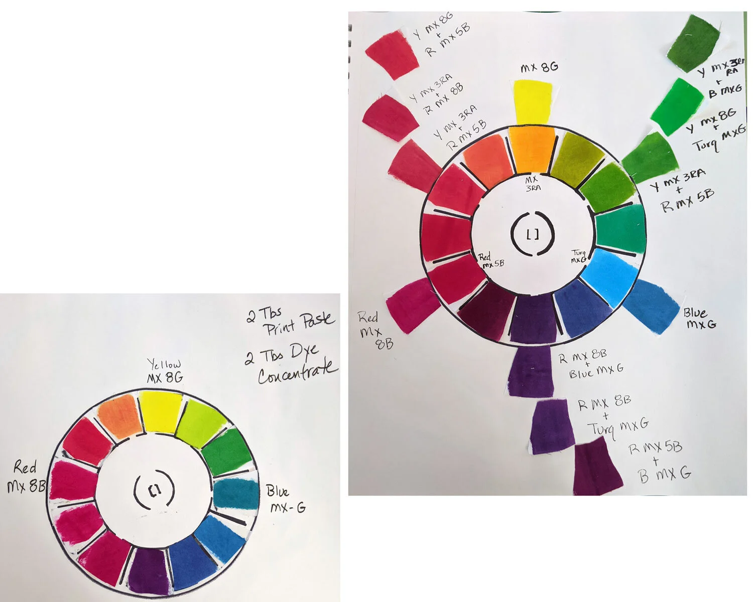
I am behind on posting images for the Dye Support Group. Life seems too busy some days to take the time to blog about my life. Rewind a couple of weeks to my first attempts at exercises from Chapter Three of Ann Johnston’s Color By Design. I learned a lot from each exercise and need to revisit several at a later date to get accurate results. I enjoyed working for my sketchbook only and had some happy accidents along the way even when I missed the mark.
Paint a Color Wheel - My first and second attempts. I need to go back and try a third time especially in the red variations.


For green, I started with an equal amount of yellow and blue and then added yellow incrementally. I approached the exercise mathematically. I thought if I started with equal amounts, I would get a base color to work from. In the future, I think I should start with yellow and add blue in small increments. The blue was dominant and it required much more yellow than I anticipated.

Lessons learned - pay better attention to painting straight so as not to overlap lines next time. I added blue to yellow this time but only in 1/4 tsp increments. I need to start on a larger piece of fabric or adjust my increments so I can get from yellow to blue.


I need better lighting in my laundry room. When wet, it appeared I was achieving black. Once dry and in better lighting, it was obvious that I need to try again. Or, stick with using the premixed black dye powders I generally use until I can try this exercise again. I really like a lot of the colors though so am keeping these pages for future reference.

I really should have started over and done all of these another time. However, I’m impatient and wanted to get to the next Chapter. So, I am working out some of the issues I had here while working on future Chapters.

Dyeing Support Group
Do you feel quarantined, lonely, and still experience a desire to dye? If so, some of my friends and I are starting a Dyeing Support Group. I love to read art books, grab a couple of tips from each, but fail to ever complete the exercises. I am challenging myself to work through all the exercises in Color By Design by Ann Johnston. My friends and I are going to work at our own pace, as we all have other things going on even if we stay in our pajamas all day. All of those 1950’s photos of women wearing heels and a dress in the kitchen were obviously staged. Through zoom and email, we will cheer, curse, and share our experiences with each other. The book is our guide and as long as we all work in the order of the exercises we should be able to support each other. We have to get creative to find ways to stay creative and motivated to reach new goals.
Day 1
Dye Mixed and in the Fridge: Warning Sign for Kids that hang out in my basement

My Studio Assistant, Indie
It looks like she didn’t read the sign, but I promise she didn’t drink the dye.